19
Sep 2018

Wildposting is an extremely effective advertising medium that reaches a gigantic audience while creating brand awareness and recognition. However, the amount of engagement is significantly influenced by the design of the poster. There are many elements that go into creating a design, but color is one of the most significant fundamentals. When creating a poster, it is crucial to pick eye-catching colors to attract maximum attention. We also associate colors with varying thoughts and feelings, so it is essential to choose colors that are suitable for your brand image.
Here are some tips to help you select the best colors for your wild posters.
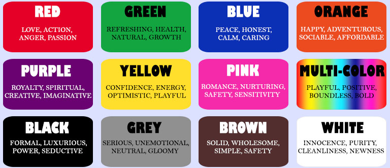
Bright and vibrant colors create sensational posters that standout through all the advertising clutter. When determining which bright colors to use, it is beneficial to consider which emotions each color coveys. Blue provokes feelings of calmness, honesty, and peacefulness so it is great to use if you want your brand to display a sense of trustworthiness. Orange elicits happy, friendly and adventurous thoughts which makes it a good fit for social campaigns. Yellow is one of the most visible colors from a distance and is best suited for playful, optimistic and/or energetic brands. However yellow should be used with caution because in some situations it can convey cheapness. Red is a very lively color that is associated with many strong feelings like love and anger. It is great to use if you want your poster to scream excitement. Purple is an excellent color to use for luxurious brands or high-quality products. Green is associated with nature and growth which makes it well-suited for natural and/or health brand images. Multi-color designs work best for diverse and multi-channel brands.
White is associated with innocence, purity, and cleanliness. However, full white posters are not as noticeable and tend to become very wrinkly extremely quickly. Grey is a neutral, unemotional color and brown relates to items that are natural and/or simple. Black is a formal color that can elicit feelings of powerfulness and sophistication. However, darker shades should be used with caution since sometimes they do not translate as well on posters.
Certain colors are also best suited for specific seasons. Pastel and light colors are often used during Spring and bright shades are excellent for Summer. Earthy brown, yellow and orange are awesome Autumn colors while cool shades of black, blue and white represent Winter.
With posters, it is imperative to select colors that will make your message comprehensible in a short time frame. You should also consider the contrast of the background and text to ensure that the writing is readable and stands out. Check out our website, Facebook and/or Twitter Page to view poster images so you can get an idea of which colors are most appealing and suitable for you. We can’t wait to see all your designs and which color combinations you come up with!

Recent Posts
Categories
- General Category
- Advertising
- Outdoor Advertising
- billboards
- flash mob
- Guerilla Marketing
- Street Advertising
- Seasonal Advertising
- Ad Campaign
- wild posting
- creative ads
- Chalk Illusion
- marketing
- Experiential Marketing
- Branding
- Marketing Budget
- Guerrilla Advertising
- Offline Marketing
- Print Ads
- Offline Promotions
- Chalk Art
- Advertising Campaign
- Marketing Campaign
- Taglines
- Projections
- Design
- Murals
- Mobile Vehicle Advertising
Archives
- November 2019
- October 2019
- September 2019
- August 2019
- July 2019
- May 2019
- March 2019
- February 2019
- January 2019
- November 2018
- October 2018
- September 2018
- August 2018
- July 2018
- June 2018
- May 2018
- February 2018
- January 2018
- August 2017
- March 2017
- January 2017
- December 2016
- November 2016
- October 2016
- September 2016
- August 2016
- July 2016
- June 2016
- May 2016
- April 2016
- March 2016
- February 2016
- January 2016
- December 2015
- November 2015
- October 2015
- September 2015
- August 2015
- June 2015
- December 2014
- November 2014
- October 2014
- August 2014
- July 2014
- June 2014
- April 2014
- January 2014
- December 2013
- February 2013
- December 2012
- October 2012
- September 2011
- June 2011
- March 2011
- February 2011
- November 2010
- July 2009
- June 2009
- May 2009
 Creative Guerrilla Street Marketing Services