13
Nov 2019
Do you want your wild posting to leap off the board and snatch attention?
Well contrast will make that happen…
In design, contrast is created by differences in elements such as size, shape or color. Contrast establishes a hierarchy and adds visual fascination to designs. If everything in a layout was the same, then it would look tedious and dull.
When working with contrast, it’s necessary to make a substantial difference because too subtle of a difference can look like an error. However, too much contrast will cause nothing to stand out since all components will be contrasting. Thus, it’s essential to establish a contrast balance by creating a design that highlights elements but doesn’t try to highlight all the elements.
Before starting a design, determine which items are the most crucial for people to notice. Ask yourself, if they had to read only one thing, what would it be? When you establish what that thing is, then it will be the item that is the most different from everything else.
Since people are on the move when they go by wild postings, utilizing contrast will ensure your poster pops out. Here are 7 ways to add contrast to your wild posting…
Color
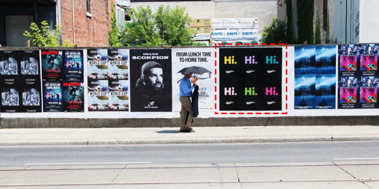
Color is one of the first features people notice in a design and utilizing varying values, saturations and/or hues creates contrast. For instance, combining light and dark colors, desaturated and bright colors, or opposite hues on the color wheel. In the wild posting above, every Hi sticks out since it is bright colors on a black background.
Size
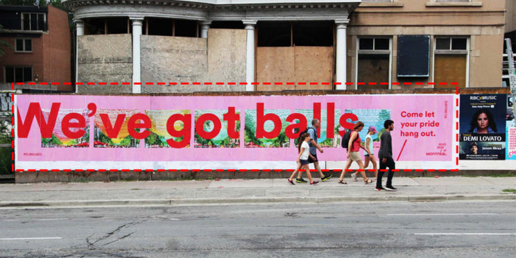
Incorporating items of several sizes in a wild posting crafts contrast. The most valuable points should be the largest to ensure it can be seen from fluctuating distances. For example, we’ve got balls is the most noticeable part of the wild posting because the font is massive compared to everything else on the poster.
Texture
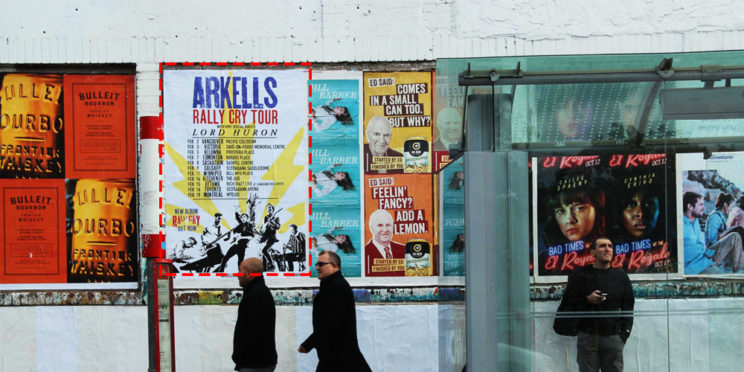
Textures generate contrast when their attributes differ strongly from one another. For instance, a raised item compared to a flat item or a rough item compared to a smooth item. In the wild posting above, the grainy texture of Arkells causes it to contrast with all the other elements.
Typography
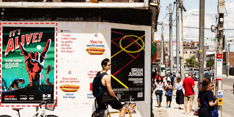
It’s essential to use typography people can clearly read since they are typically in motion when going by wild postings. The crucial words you want people to examine should contrast with insignificant words.
Contrast is formed between words through font style, size and/or weight. For example, you can emphasize text by adjusting the tracking, kerning or leading. Mixing serif with non-serif, condensed with extended, bold with normal, or all caps with lower caps will also produce contrast. The wild posting above utilizes a mix of fonts but It’s Alive contrasts the greatest with other text causing it to attract the most attention.
Spacing
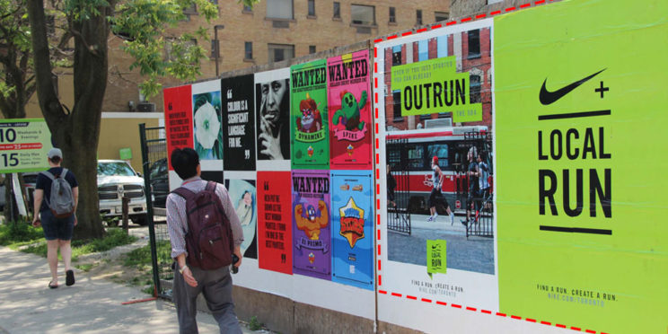
An item can be emphasized by adding space around it. It will especially stand out if other items on the poster have little to no space around them. Contrast is produced in the Nike wild posting by surrounding the logo/Local Run with lots of space.
Position
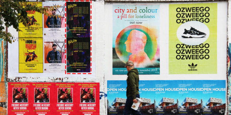
The placement of an element compared to other elements also creates contrast. If all items on the poster are right aligned and one item is left aligned, then the left aligned item will grab the most attention. The word Bulow jumps off the wild posting above because it is left aligned while all the other text is right aligned or centered.
Unexpected Element
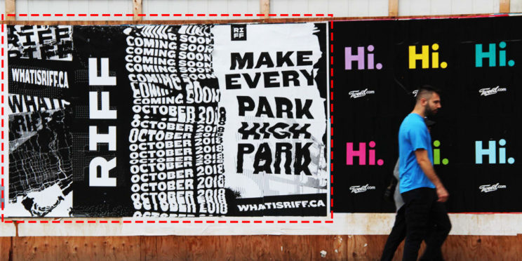
Adding something unexpected to a design creates contrast because it is not standard. For example, the text in the RIFF poster stands out because it’s written on a curved line as appose to the typical straight line.
Recent Posts
Categories
- General Category
- Advertising
- Outdoor Advertising
- billboards
- flash mob
- Guerilla Marketing
- Street Advertising
- Seasonal Advertising
- Ad Campaign
- wild posting
- creative ads
- Chalk Illusion
- marketing
- Experiential Marketing
- Branding
- Marketing Budget
- Guerrilla Advertising
- Offline Marketing
- Print Ads
- Offline Promotions
- Chalk Art
- Advertising Campaign
- Marketing Campaign
- Taglines
- Projections
- Design
- Murals
- Mobile Vehicle Advertising
Archives
- November 2019
- October 2019
- September 2019
- August 2019
- July 2019
- May 2019
- March 2019
- February 2019
- January 2019
- November 2018
- October 2018
- September 2018
- August 2018
- July 2018
- June 2018
- May 2018
- February 2018
- January 2018
- August 2017
- March 2017
- January 2017
- December 2016
- November 2016
- October 2016
- September 2016
- August 2016
- July 2016
- June 2016
- May 2016
- April 2016
- March 2016
- February 2016
- January 2016
- December 2015
- November 2015
- October 2015
- September 2015
- August 2015
- June 2015
- December 2014
- November 2014
- October 2014
- August 2014
- July 2014
- June 2014
- April 2014
- January 2014
- December 2013
- February 2013
- December 2012
- October 2012
- September 2011
- June 2011
- March 2011
- February 2011
- November 2010
- July 2009
- June 2009
- May 2009
 Creative Guerrilla Street Marketing Services